Streamlining Camera Mode Selection in iOS
Project Overview
This project is a comprehensive study of the usability of the camera mode selection interface in Apple’s iOS. Through a structured user-centered design process, I identified key user pain points with the existing interface and developed a high-fidelity, interactive prototype of a streamlined alternative.
The final proposed design, a grid-based menu, proved to be significantly more efficient and intuitive for users in final evaluations.
1. User Research
The project began with a multi-method research process to understand how users interact with the current camera interface and where friction appears.
- Naturalistic & Participant Observation: Identified common errors such as accidental mode switching (especially when zooming), difficulty selecting the correct mode quickly, and a general lack of awareness of the currently selected mode.
- User Surveys (n=28): Revealed that 85% of participants have accidentally captured media in the wrong mode, and 78% have missed a photo opportunity due to difficulties with the interface. Key requests included faster mode switching and easier navigation.
- Heuristic Analysis: The current carousel-style interface was evaluated against established usability heuristics, revealing issues with discoverability (hidden modes), ease of use (small, cramped tap targets), and equity (potential challenges for users with visual or motor impairments).
2. Design & Prototyping
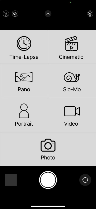
Based on the needfinding insights, I brainstormed over 30 design alternatives, ultimately prototyping three distinct on-screen interfaces: a grid menu, a drop-down menu, and a wheel menu.
After an initial round of evaluation with paper prototypes, the grid menu was selected as the most promising solution. It most effectively addressed the core user needs by:
- Displaying all camera modes at once, enhancing discoverability.
- Using large, clear tap targets to reduce errors and improve comfort.
- Allowing for direct selection, making it faster than swiping through a sequence of modes.
3. Evaluation & Final Prototype
The grid menu concept was developed into a high-fidelity, interactive prototype and evaluated against the current iOS interface in a live demonstration with users.
- Quantitative Results: The prototype was rated as significantly more efficient (p = 0.011) and intuitive (p = 0.00092) than the current iOS menu.
- Overall Preference: When asked to choose, 100% of participants preferred the new grid menu prototype over the existing interface.
The final design incorporates user feedback by placing the most-used modes (Photo, Video, Portrait) at the bottom of the grid for better one-handed reachability and includes a persistent icon to provide clear feedback on the active camera mode.